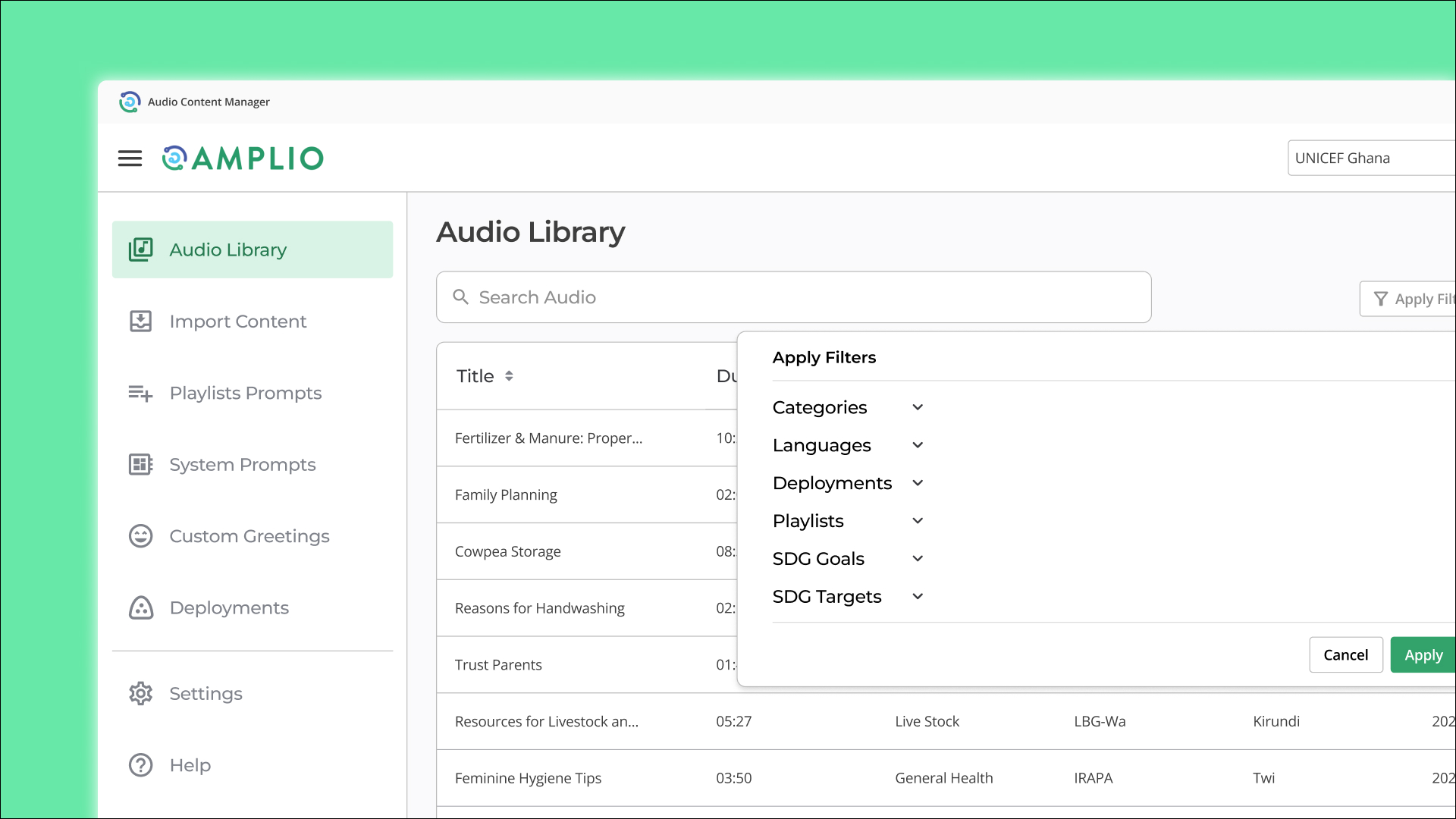
Overview
Amplio — Redesigning a legacy audio management tool to help program officers deploy content faster
Amplio is a nonprofit that delivers critical information to low-literacy communities through audio. Its Audio Content Manager (ACM) helps program officers upload, organize, verify, and deploy audio to Talking Book devices.
I helped redesign the legacy ACM to make these workflows easier to navigate, more consistent, and more scalable.
Impact
40%
Faster deployment
15 min → 9 min
Standard 30-audio-file deployment in moderated usability testing.
100+
Components & variants
Built by me across navigation, tables, forms, feedback states, and workflow patterns.
150+
Redesigned screens
Team delivery, handed off for engineering implementation.
Context
From audio files to Talking Books
Before audio reaches a Talking Book, it moves through a larger content ecosystem:
Program officers use ACM to upload audio files, match them with assigned content, verify the package, and prepare it for deployment.
A guided walkthrough of the legacy workflow—from upload through deployment—took nearly 59 minutes.
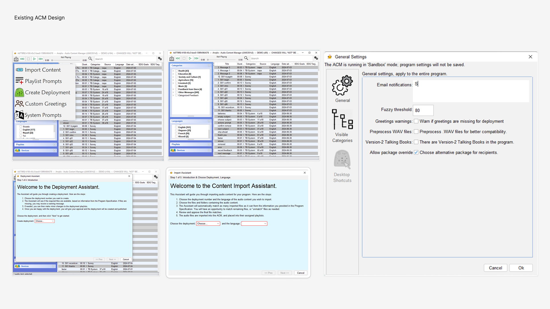
The workflow steps were necessary, but the legacy interface made them harder to complete.
Design Challenge
How might we make ACM easier to learn and navigate while keeping its core upload-to-deployment steps intact?
Research
Understanding the workflow, then auditing the interface
Our team conducted 4 user interviews with experienced and newer Amplio users to understand how ACM was used in the field. I conducted one of the interviews.
We then conducted a heuristic evaluation of the legacy ACM to identify usability issues around consistency, system feedback, error prevention, and navigation.
I led the affinity mapping and priority matrix, which turned our findings into four design priorities.
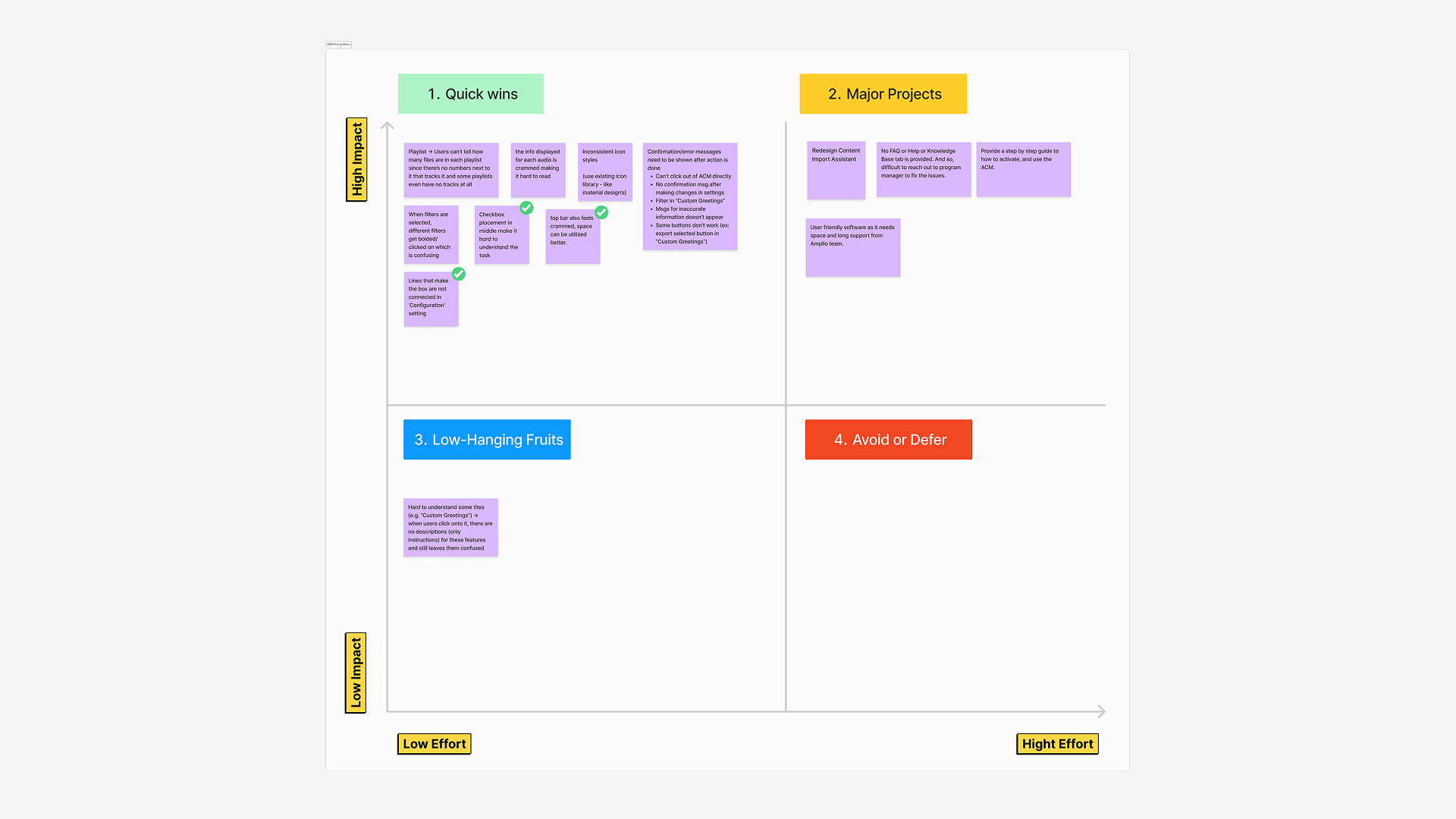
Four design priorities emerged.
01 — Guide users through complex workflows
Finding
Uploading audio content opened separate assistant windows, pulling users away from the main ACM interface. Multi-step workflows also gave users limited visibility into where they were and what came next.
Exploration
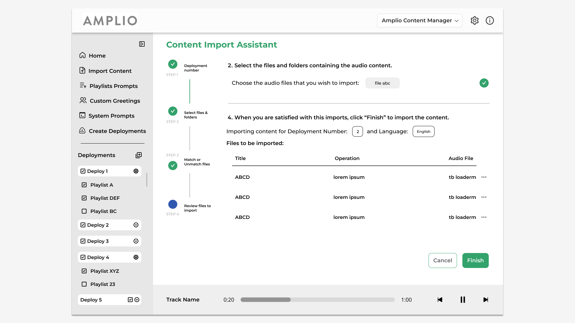
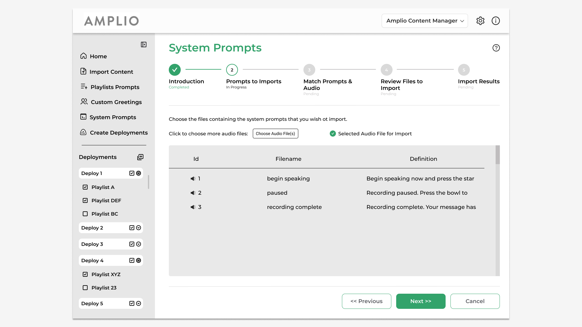
I explored vertical and horizontal progress trackers.
The vertical version added a second navigation rail beside ACM’s main sidebar and reduced space for data-heavy tables. Since the workflow had only five steps, a horizontal tracker kept the full process visible without taking space from the workspace below.
Design Decision
I brought assistant workflows into the main ACM interface and added a 5-step horizontal progress tracker.
Users could see their
current step, completed steps, and what came next at a glance.
02 — Surface the metadata that matters
Finding
The fixed left panel left less room for the audio library, forcing officers to scroll horizontally to see additional file metadata.
Each audio file could include up to 8 metadata fields, even when users only needed a few.
Design Decision
I designed two controls to give officers more control over what they could see:
Together, these changes reduced unnecessary horizontal scrolling and kept relevant file details visible.
03 — Make deployment status visible
Finding
Program managers needed an easier way to see what was upcoming, currently active, and already deployed.
The legacy ACM did not show these deployment states in one place.
Design Decision
Based on direct stakeholder feedback, I designed a deployment management table organized into:
Upcoming · Active · Archived
Program officers could now understand deployment status from one structured view instead of piecing it together across the workflow.
04 — Catch problems before deployment
Finding
Missing or unresolved content from earlier stages could still reach the final deployment flow.
Program managers needed a final checkpoint before deployment.
Design Decision
I added pre-deployment error checks that showed which part of the content package still needed attention.
This helped officers catch missing content before deployment instead of discovering problems at the end.
Scaling Consistency
Redesigning screens wasn’t enough
The legacy ACM used inconsistent icons, controls, and interaction patterns.
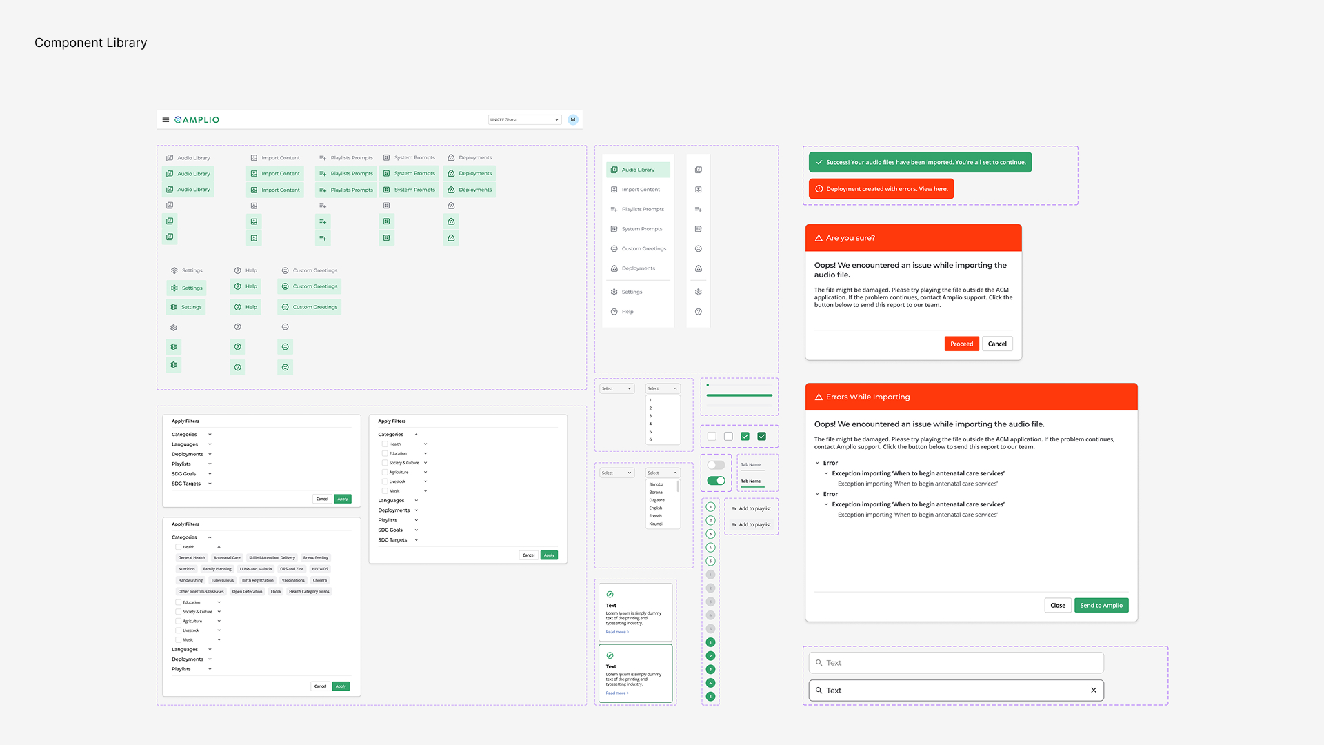
As the redesign grew to 150+ screens, we needed reusable patterns instead of rebuilding UI elements screen by screen.
100+ components and variants
I built a reusable component library across:
Navigation · Tables · Buttons · Inputs · Dropdowns · Filters · Modals · Feedback states · Progress indicators
The library helped the design team apply consistent UI patterns across ACM and was handed off with the final screens for engineering implementation.
Validation
Could the redesigned workflow save time?
A design manager ran a moderated time-on-task test with one program manager completing the same standard 30-audio-file deployment in both experiences.
Legacy ACM
Redesigned prototype
40% faster in usability testing
Testimonial
“Develop for Good’s exceptional work on the redesign of Amplio’s desktop applications will significantly improve user experience and productivity. The team’s approach and in-depth understanding of our needs resulted in a design that exceeds our expectations.”
 Read the Amplio blog post ↗
Reflection
Understand before designing
Using the legacy ACM myself helped me understand the workflow beyond what I learned from interviews. It taught me to investigate the product before jumping into solutions.
Not everything needs redesigning
Improving a legacy product doesn’t mean changing every step. Some processes existed for a reason; the goal was to make them easier to complete without removing what already worked.
Next time: I’d test with more program officers and measure task completion and error rates after implementation.